Crafting Compelling Cyber Monday Email Campaigns [+ Bonus]
Is it in the air? Yes, Black Friday and Cyber Monday, often known as BFCM, are the mother of all retail weekends, already preparing everyone for a long-awaited Christmas season.
If you own an online business, you are well aware of the potential impact that Black Friday 2023 will have on it. But let’s not overlook Cyber Monday either, as this dynamic pair is a fantastic opportunity to significantly increase your Black Friday sales and interact with your consumer base.
The secret to opening this cache? An amazing email marketing plan for Cyber Monday — and today we’ll be exploring just that.
Here’s why sending emails on Cyber Monday is crucial
Cyber Week, the busiest shopping week of the year, includes Cyber Monday, the culmination of the whole shopping adventure.
Cyber Monday, celebrated on November 27, is the ideal opportunity to launch amazing offers and earn a tonne of extra money because shoppers are especially looking for deals.
Adobe’s 2022 shopping season outlook shows how significant the holiday season, and Cyber Monday in particular, may be.
Here’s why:
- On Cyber Monday, shoppers spent $11.3 billion.
- Over the course of the holiday season, consumers spent 2.5% more than in 2021, totalling a $210 billion in spendings.
- Mobile generated 44.88% of sales, with the remaining coming from desktop and other sources.
What’s the takeaway, then? Cyber Monday is a business opportunity to not be missed. And further on, we’ll explore how to use it for your maximum benefit.
Top 5 examples of successful Cyber Monday emails
Let’s review some of the most efficient email campaigns from previous years’ Cyber Mondays.
1. Countdown timers and limited-time offers
Below you can see a Cyber Monday email campaign featuring early access and a sense of urgency to boost purchases.
Why it performs well: For the holiday season, Lenovo has created a brilliant campaign that combines fantastic discounts with eye-catching graphics. To add a sense of urgency to its message, the brand also employs countdown timers. In this approach, readers who open this email will be motivated by the countdown to take advantage of the current deals before they expire. Additionally, the language emphasizes the advantage readers will receive (Save up to 77%), encouraging them to click the call-to-action button below.
How to do the same: You can effortlessly mimic Lenovo’s email approach by repeating a few best practices this brand used. Observe how the company uses limited-time offers, various combinations of CTAs, and a selection of best-selling products with generous discounts. Repeat this strategy to boost your CTR and ROI as well.
Source: Moosend
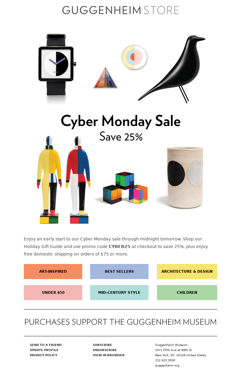
2. Plain minimalist design
Regardless of how lovely the message is, the key rule of any design is not to make it difficult for someone to perform the necessary action.
Why it works: Guggenheim’s email campaign distinguishes itself with a minimalist design that is both elegant and effective. The absence of unnecessary frills and a clutter-free layout ensure that the primary message takes center stage, providing an optimal user experience. The email strategically focuses on key elements — a striking product image, a concise headline about limited-time offers, and a prominent call-to-action button.
How to do the same: Ensure that your email template has a logical hierarchy, appropriate white space, and a clear structure. Draw attention to the CTAs; they should entice readers to visit your website and make purchases.
Source: Selzy
3. Interactive content
The reader’s attention is captured through interactive content. You can direct them to your sales page once you’ve got their attention. This is accomplished well in Loft’s inventive Cyber Monday email sample.
Why it works: In keeping with the “Start loading up your closet” theme, the email makes use of a cool loading bar GIF. Because of how noticeable the bright pink highlights are, the CTA button is very clickable. The large font makes the offer very clear as well. And the brand uses animated GIFs to draw attention to specific parts of this email. If you follow the same strategy, you’ll stand out in the recipient’s inbox among all the static emails.
How to do the same: Include interactive content to encourage recipients to actively engage with the email. By allowing users to manipulate content, such as exploring product features through sliders, you’ll create a memorable and participatory experience. Tell a visual story within the confines of an email. Let users swipe through carousel images, fostering a deeper understanding of the offerings.
Remember that interactive elements extend beyond mere engagement — they provide a personalized touch. With clickable sections leading to tailored content, users feel empowered to explore products and promotions based on their preferences.
Source: Mailerlite
Bonus: Best practises for Cyber Monday email subject lines
Because everyone uses Cyber Monday as an opportunity to boost sales, it takes more than on an average day to get user attention. To improve your chances of getting an open, consider the following best practises:
- Preview text: To make the most of the extra inbox space and characters, pair your preview text with your subject line.
- References to exclusivity: Make it clear in your email that it has special Cyber Monday offers that readers won’t find anywhere else.
- Words like “last chance,” “limited time,” and “hours left” can be used to convey a sense of urgency. To save text and space, use numbers and percentage symbols.
- Emojis: Use emojis to make your emails stand out. However, use plaintext (to make it stand out) if everyone in your sector uses emojis.
- Compelling CTAs: Call attention to “Cyber Monday” in your subject lines so that readers will know what to expect from the email.
- Personalization: To make subject lines more unique, provide the recipients’ names or information about previous purchasing patterns.
- Segmentation: To increase relevance and open rates, customize subject lines depending on recipients’ preferences or past purchases.
- Simply written copy: Shorter subject lines typically perform better, especially on mobile devices, so keep them brief and to the point.
- Notifications: Send a heads-up email to your subscribers before Cyber Monday informing them of the best offers.
Reminders: To make sure your audience doesn’t miss out, use abandoned cart emails and Cyber Monday sale reminders.


